Why the iPhone UX Sucks
I bought an iPhone 3 months ago.
For some of you, this statement means nothing. But those who know me well will definitely raise an eyebrow right now.
You see, for more than 15 years I’ve been an Android user. I had the first iPhone when it was first released, just long enough to see it represented a revolution in the smartphone ecosystem. Yet, I couldn’t stand its user interface so I gave it to my co-founder at the time.
When Android came out shortly after, I bought one and stuck with the Android family until 3 months ago.
As long as I still cared about the ‘which one is better’ wars, I always sided with Android passionately. I never understood Apple and its fan base, and the only product of Apple’s that I appreciated (and still do) is the Macbook Pro.
This is why a friend who heard about me buying an iPhone wondered what made me switch to ‘the dark side’.
In this (a bit unordinary) post – I will explain my motivation for this move, and whether the iPhone met my expectations.
As the title suggests, I will stay in the realm of product management, though, depending on which team you are – you will either totally relate or totally dislike me afterwards.
Stay open. That’s all I’m asking.
Let’s roll.
Why I switched to iPhone
I never liked the iPhone because I didn’t like the user interface (a bunch of squares scattered around on every screen) and the very little options you had to adjust it to your needs.
You either align with how Apple wants you to do stuff or you will suffer from every second you use the device.
I belonged to the latter.
Android provided tons of flexibility and I could adjust it to my needs just fine.
And once I discovered the OnePlus brand, I stuck to it because their phones were the ‘least bloated’ ones with pre-bundled apps. My last device was the OnePlus 7T. And it was a good one.
Now, you know me – I’m a guy who values efficiency and productivity, and Android suited me well in that regard… until it didn’t.
Problems started arising about 3 years ago, on a couple of dimensions, and reached a peak where the experience was no longer bearable. Let me elaborate.
Reason 1 – over-optimization
Look, everyone knows the Android Play Store is a junkyard. Everyone can upload their s*%t to this store and no one is reviewing it unless a group of users start to flag your app. This brings up a whole bunch of security & privacy concerns, to the point where Google decided to fight it.
Some of the measures they took were great. They reviewed a bunch of apps and gave them a ‘verification’ badge that you could trust. And there were some other good tactics they applied (I don’t want to delve into this because it’s not our topic).
However, some of the other stuff they decided to do was focused on making their permissions model more strict and optimizing what apps can do in the background.
Theoretically, a good approach. Execution – not so great.
What happened instead is:
- The Android OS became much heavier, making my device slower
- Permissions would be taken away from apps I didn’t use in a while.
- Services I didn’t use for a period of time – would be killed by the OS
As a result – some of the apps and services on my phone would simply stop working at some point.
For example – My phone had an app that controlled the gateway to our building, and when delivery guys came, it would ring on my phone and I could open the door remotely.
Alas, my Android OS decided the service wasn’t used often enough and killed it automatically. As a result – people were ringing, but it never came through.
I would also randomly stop receiving push notifications from specific apps with no explanation, and eventually I discovered that the OS simply killed these apps, because I didn’t open them (I was reading their notifications, though).
It came to a point where I couldn’t trust my device anymore to let me know when I needed to know something. That was unbearable.
Reason 2 – I can’t have hands-free calls
Back then in 2009 I had a bluetooth earphone (one ear only) manufactured by Motorola. The sound was crystal clear for both me and the other side. So good that I could have a typhoon near me and nobody would hear it.
Since 2009, the earphones offered by the various vendors have deteriorated to the point that they were useless for making phone calls (unless I’m sitting in a sound studio).
Yes, media-wise, the sound is great, and you also have advanced noise cancellation today, so you can walk in the mall and hear everything that comes through your earphones very clearly.
But when it comes to the microphones and voice conversations, it seems like everyone has dropped the ball.
Being an efficient guy, I needed both my hands to be free when I’m speaking on the phone. I could then cook, take meetings on the go and do all sorts of things. Having one hand holding my phone during a phone call makes me very unproductive.
Sadly, any time I was having a phone call and stood in a place which had even a small gust of wind (not to say a mall or a train station) ended the exact same way:
The other side would hear everyone but me.
This is why I spent a great deal of money and time, testing all sorts of earphones, including Jibra, Sony and others. They all sucked.
All vendors failed miserably at this, even if their earphones advertised that they are equipped with ‘six microphones’. I was really missing my old Motorola earphone.
Then, I started being vocal about this, and several friends who heard my vents about this topic pointed me to the exact same place:
“Dude, you need to get Apple’s Airpods Pro 2”
So I did. They were indeed better than everything I tried before, but it still wasn’t as great as my old good Motorola.
I came back to my friends, who recommended me those earphones, telling them it’s cute, but not more than this. So they told me –
“So they told me, ‘Dude… you only did half the job. If you want them to work perfectly, you need to buy an iPhone.’”
And so I did.
I desperately needed the productivity boost and a phone I could trust. Did the iPhone live up to my expectations?
Let’s see.
The bad stuff
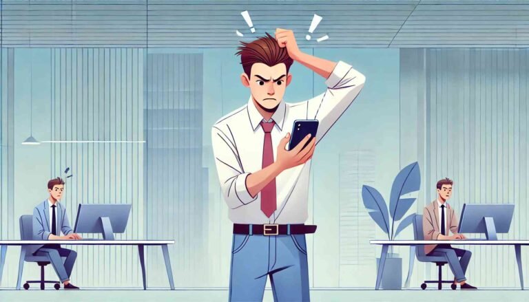
iPhone’s UX
TL;DR: the iPhone UX is one of the worst I’ve seen in a product. Sorry, Apple fans – I know you hate me right now, but I will provide data & facts, and if you stay objective – it might open your eyes.
So – Why do I feel so confident to come up with such a strong statement?
Reason 1 – One-handed use is (nearly) impossible
To begin with.. And this is a knockout one – the phone can’t be operated effectively with one hand.
Now, to clarify – I bought the iPhone 15. It doesn’t have any buttons on its interface. Everything (aside from the side buttons) you wish to do – needs to be done via the touch screen.
Unlike the Android – the ‘back’ button is not at the bottom, but rather on the top left, and it’s on the application level.
iOS doesn’t recognize the significance of a ‘back’ button as an operation that needs to be supported on the OS level.
I’m used to holding my phone in my right hand, and using it solely with that hand. That can’t work with an iPhone, as the ‘back’ button is too far from my thumb.
Yes, I can stretch it, and that’s what I did in the first few weeks, but because of that I developed tendonitis in my thumb (a type of inflammation). I had to give up eventually and use both of my hands.
I also tried various accessibility features on the iPhone that supposedly should help with this mission. For example – turning on an option that if you scroll down from the bottom of the screen – the top of the screen comes down. It works, but doing it each time I want to go is a nuisance, and it’s better to simply use both of your hands.
This fact (the need to use both hands to operate the phone effectively), by itself, is a reason to give Android the win in terms of UX.
Reason 2 – Overreliance on weird gestures
Not sure why, but too many things on the device can only be performed by gestures.
You want to switch to ‘do not disturb’? Pull from the top right. Oh… but make sure you don’t pull beyond the middle of the screen because then it will switch to the music screen.
You want to see your notifications? Pull from the exact middle of the top screen.
You want to switch between the running apps? Pull from the bottom, stop in the middle and press with your thumb.
If it sounds dumb to you, it’s because it is. I feel like I’m trying to cast spells with my phone and I need to remember the exact combination.
I guess this is the result of insisting to not have constant buttons at the bottom of the screen like Android (those are not physical buttons, it’s simply that this touch area is reserved for built in touch buttons which always perform the same way).
Aside from it being completely annoying – there is no real way for you to discover this by yourself. I had to watch a few Youtube videos and consult Perplexity in order to understand how to operate my iPhone.
Again – this fact, by itself, is a clear indication of a bad UX.
Reason 3 – inconsistent notifications handling
Push notifications are important (at least for me). They allow you to understand what’s going on without needing to unlock your phone and/or launch an app.
However, Apple made the notifications handling really awkward. Here are some examples:
If the screen is locked, you dismiss notifications by swapping them to the left.
If your screen is unlocked – and you received a notification – you need to swap it up in order to dismiss it. Aside from the inconsistency – it’s not that easy to swap up at the top of your phone. Again, either stretch your thumb or use your second hand for dismissing a notification.
Additionally, when you try dismissing a notification by swiping it to the left – you need to make sure you swipe it ‘far enough’ for it to disappear. If you didn’t – it will only move aside, revealing a button asking if you wish to clear it. What?
Sometimes, the notifications you’ve missed, instead of piling up, will simply disappear. I’ve been using this device for more than 3 months and I’m still unsure what’s causing it. The only way for me to bring them back is to unlock my phone and pull the notifications tray from the top of the screen (but pay attention – you need to do it from the exact middle of the screen or it won’t work).
This stuff constantly confuses me.
Reason 4 – Weird and inconsistent flows & product decisions
You want to download an app? Find the app you want on the App store and click on ‘download’. You would assume that this should be enough to start the download (this is how it works on Android, unless a paid app). You would assume wrong.
On iPhone you’re not done yet at this stage. You have to press the physical right button twice (!!).
It took me a while to figure it out. Nothing else is being performed by this physical button, so why specifically app downloads? I guess only god knows and some demi-gods at Apple.
Aside from being totally inconsistent with anything else – it’s just weird.
But you know what’s weirder? The built-in alarm clock app.
Alarm clocks should be trivial by now. The world had almost 20 years to experiment with alarm clocks apps so there is no reason in the world why the flow can’t be optimized.
But Apple being Apple – they had to have their own way.
The first time you launch the Clock app (which contains the alarms) and try to set an alarm – it forces you to download their ‘Health’ app. This aggressive behavior is something I’ll discuss in a second, but aside from being forceful – it just doesn’t make sense.
All I want is an alarm clock. Why do I need to download another app?
I tried downloading other alarm-clocks apps from the app store, but they all cost money and I refuse to pay money for an alarm clock. So I gave up and downloaded their ‘Health’ app and then I had to answer all a bunch of questions about my sleeping habits – so I can finally set an alarm.
To be honest, it did feel a bit humiliating being forced to download an app I don’t need, and answer a questionnaire about my personal life. And believe me, I’m not a guy who is easily humiliated.
Do you really want to design your products in a way which humiliates your users or forces them to use products they don’t need? I guess none of you do. So why does Apple feel comfortable with this?
Another thing which affects the alarm clock is the volume system. On Android you can set different volumes for media and the ringer. On Apple you have only one master volume which affects all. No exceptions.
This becomes extremely ridiculous at the time of alarms.
You see – I like to keep my ringer on low volume as I don’t want to be distracted anytime someone sends me something.
But Apple applies this logic on the alarms as well, to the point that I can’t hear them, because they are so weak.
What kind of a product decision is that? If I set an alarm – it means I want to be notified. You can slowly increase the volume up to a certain level, but you can’t keep it nearly mute.
Within the 3 months I’ve owned this device, I missed at least 10 different alarms, and sometimes I didn’t even wake even though the phone was near me (happened to me today again).
For all these reasons I consider the iPhone’s UX vastly inferior to the Android one. In fact – it’s vastly inferior to most consumer products I use. I guess it’s because others must optimize their UX if they want their products to be successful, and Apple can get away with whatever they want – because of the cult they built around their products.
Other drawbacks of the iPhone
The iPhone has some other stuff that annoys me. I won’t delve on this too much, as I don’t want this post to become too lengthy.
So, just in short:
Siri
Apple was one of the first to introduce AI agents, back then in 2012. It was very innovative at the time, but sadly, it seems like Siri hasn’t advanced much since then.
The AI feels really limited, and also inefficient.
It’s not designed for a true conversation. You ask it something, it thinks for a while, and then it will come back with your answer. There is no true ‘conversation flow’ like ChatGPT live conversation feature.
It’s a task driven agent that can do one thing at a time. This was cool 10 years ago, but today customers’ expectations are much more advanced.
The things it can also do are quite limited as well. You try stirring a bit to the left or the right – and Siri becomes helpless.
You have the ability to use Siri to invoke apps and trigger some actions based on commands that you pre-configure. Those are limited, and Siri insists on providing feedback after each invocation which really slows things down.
The inconsistencies I mentioned before don’t skip Siri. Sometimes it will tell you it can’t read Hebrew and sometimes it will read Hebrew text just fine. Depending on its mood, I guess.
Sometimes, when it reads you a message it will start reading you the links addresses as well (as in ‘h-t-t-p-s….’). This is extremely silly, annoying, inefficient and just… pointless.
The product managers behind this product need to take themselves more seriously. After all – Siri is available to hundreds of millions of users.
How can it be that not a single product manager at Apple woke up and said – “Guys, reading link addresses up loud is just plain silly. Let’s update this behavior”.
Overall, the AI behind Siri feels very dated. Especially given the flood of progress we’ve witnessed in the last few years.
I can’t really use it for any productivity boost, and it’s a shame, because in theory – a built-in AI agent within your phone could be one of the main productivity boosts one could hope for.
Hopefully ‘Apple Intelligence’ might change this, but it won’t be available for my phone (it’s only for iPhone 16 onwards).
Self promotion
Apple constantly tries to promote its services via the iPhone.
Now, it was ok if it made an attempt and then you could decline and turn off future offers, but you just can’t.
For example:
At least once per day, it asks me to turn on iMessage. I don’t want to, so I decline – but it will keep asking me until I say yes. Which raises the product question – if I must use it (because I won’t be able to decline forever, eventually I will approve it, even if by mistake) – then why ask?
Another one – it shows you a notification badge on your ‘Settings’ app and when you open it, you see that the notifications are self promotions for buying iCloud storage. Those will never go away.
Yes, I could turn off the badge in the ‘Settings’ app, but then I won’t know when an important update is waiting for me.
Earlier I mentioned how it forced me to download its health app, and from time to time it tries to sell me its music service.
This is the evil side of product management, and I’ve written a post about it back then. You can find it here.
Apple’s way or no way
I’ll make this one short because this is well known.
For each feature, service or app that was created by Apple – there is only one way to operate it. The way Apple wants you to.
This is very true for the iPhone itself, and Apple’s apps.
You can only put app icons on your screen. Yes, there is one screen devoted to widgets, but I’d like to mix those so each screen will have its own function. I can’t.
I can’t replace the launcher and the lock screen apps with different apps that offer more customization. I must use Apple’s.
The lack of flexibility and customization features stir many people away from Apple and it was also one of the main reasons I didn’t bother with Apple for so many years.
At least they got rid of the dreadful iTunes…
The good
I’ll make this one very short:
Everything works.
The fact that Apple maintains full control over the hardware and the OS pays off in terms of stability and availability.
Once you get the awkwardness of how things work, and you accept the fact that you won’t have the control you want and that the UX is crap – you can be at peace with the device.
All services are working, running and delivering what they promised to deliver (again, sometimes in their awkward manner).
It just works!
And for many people – this is what they are looking for.
The second thing which is good – is that the Airpods Pro 2 delivers beyond expectations.
I tried them in many places, including malls, train stations and crowded spaces. Nobody complains on the other side when I speak with them on the phone. They can hear me crystal clear.
Well done Apple!
At the end of the day though, and from a product management perspective – I think it’s admirable how Apple has managed to build a cult around its products.
The iPhone and I
So – did switching to the dark side pay off?
In short – yes.
I bought an iPhone to address two issues – the fact that I could no longer trust my Android to function as it should, and because I was looking for the productivity boost of having both of my hands free when speaking on the phone.
These two are solved, and in that regard – mission accomplished.
That being said – this is far from being a ‘knockout’ win. It’s merely a win by points, points that were critical to me.
Can I understand the cult around Apple’s products?
While I acknowledge that the introduction of the iPhone was one of the most disruptive inventions of its time, I don’t think the hype is justified today. It’s been almost 20 years – and if you look at the device at the time of its launch (2007, link to the launch here) and today’s version – I’m not sure the difference is very noticeable on the concept level. Yes, it’s much faster, with much more features, but conceptually those are the same.
And the million dollars question – do I love my iPhone?
No. I can’t say that I do.
But for now it’s better than the alternative.